Colours have meanings, we all know this. Depending on it they cause different reactions, and this is something brands make use of as they integrate colours on their strategies: they transmit an image, a personality and a message. In social networks especially, colours are an efficient tool to reach users, arouse feelings and make them go emotional. What are social media brands trying to transmit with their colours, logo and image? How does it affect branding? Today we reveal the truth about colours and their meaning on social media.
To explain it we share with you this interesting infography from the blog Apasionada de las Redes Sociales (in Spanish). It is an amusing analysis of the different social networks and the meaning of the colours they use in their logos, enjoy it!
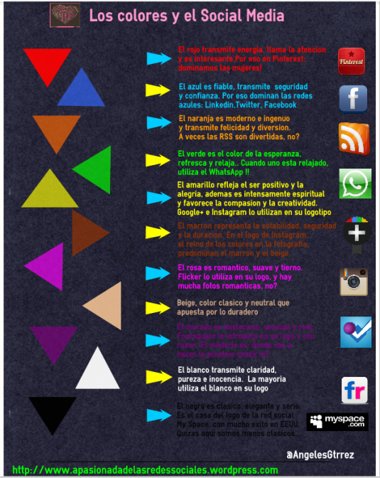
Red: it represents attention, energy, vitality and speed. Now you understand why Pinterest has a red logo, are we not right?
Blue: it transmits safety, reliability, confidence and transparency. This is why most social networks are bluish! Facebook, Twitter, LinkedIn, Tuenti…
Orange: modern, inocent, innovative and especially HAPPY AND FUNNY. Social networks are for joy ?.
Green: symbolizes the natural, hope, coolness and relaxation. Is there anything more natural than Whatsapp?
Yellow: it represents optimism and joy. People also say that it stimulates creativity and compassion. Yellow features the logos of Google+ and Instagram, but it is not very characteristic of any social network given its bright tonality.
Brown: for durability and stability. It is associated especially with Instagram. Moments you capture forever!
Pink: romantic, tender, nice and soft. Flickr has it on its image, although it is not predominant. We all have a romantic picture. Or not?
Purple: it represents luxury, mystery, reality and sensuality. What can be more mysterious than the random check ins on Foursquare?
White: purity, cleanness, peace and innocence. It is hard to see, so it is always used in combination with other colours. Almost all networks use it… Go have a look!
Black: elegant, sophisticated, simple and sober. Just like with white, it does not work very well on its own: it is too dark and serious. MySpace tried it, but we can see that it did not work very well.
Now you know, add colour to life ?. Do it wisely, but do it the way you like!
Visit our influencer marketing agency in New York.